SECRET LOCATION
As a content studio for emerging platforms, Secret Location required a wide variety of design and branding work, and My responsibilities encompass a wide reaching field of design demands from 3D environment modelling, layout, design, 3D animation, 3D motion graphics, Architectural Design & fabrication and other various duties including implementation of the aforementioned assets into realtime game engines for various 360° Virtual Reality projects.
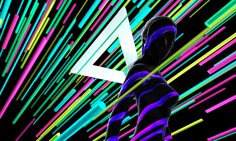
This included development ideation and execution of core branding iconography including the Secret Location VR Bumper, and other brand-specific design and motion graphic animations and executions. I was responsible for all aspects shown in this section.
SL Bumper Animation
LED Array Animation

Christmas Card (Print)

Branding Experiments
With the introduction of the ‘Make Believe’ experiential location based entertainment space, Secret Location thought to rebrand to be more focused on the inclusion of human interaction and a sense of ‘fun’, seeing the brand as a bridge between the real world and the fantastic. The initial design direction for the rebrand was curated by Creative Director Pietro Gagliano. I was responsible for exploring these new paradigms and fleshing out the design aesthetic in conjunction with Senior 3D Artist Steve Miller. My contributions are shown below.
Part of the work at Secret Location is Pitches for new projects to a number of different entities. These require a certain level of polish in order to convey our confidence in the idea. However, Secret Location pitches are generally characterised by very tight deadlines in an ever changing creative landscape, leaving not much time for refinement of design ideas or execution. The Logos below are a selection of some of my designs from that process.
Behind Enemy Lines
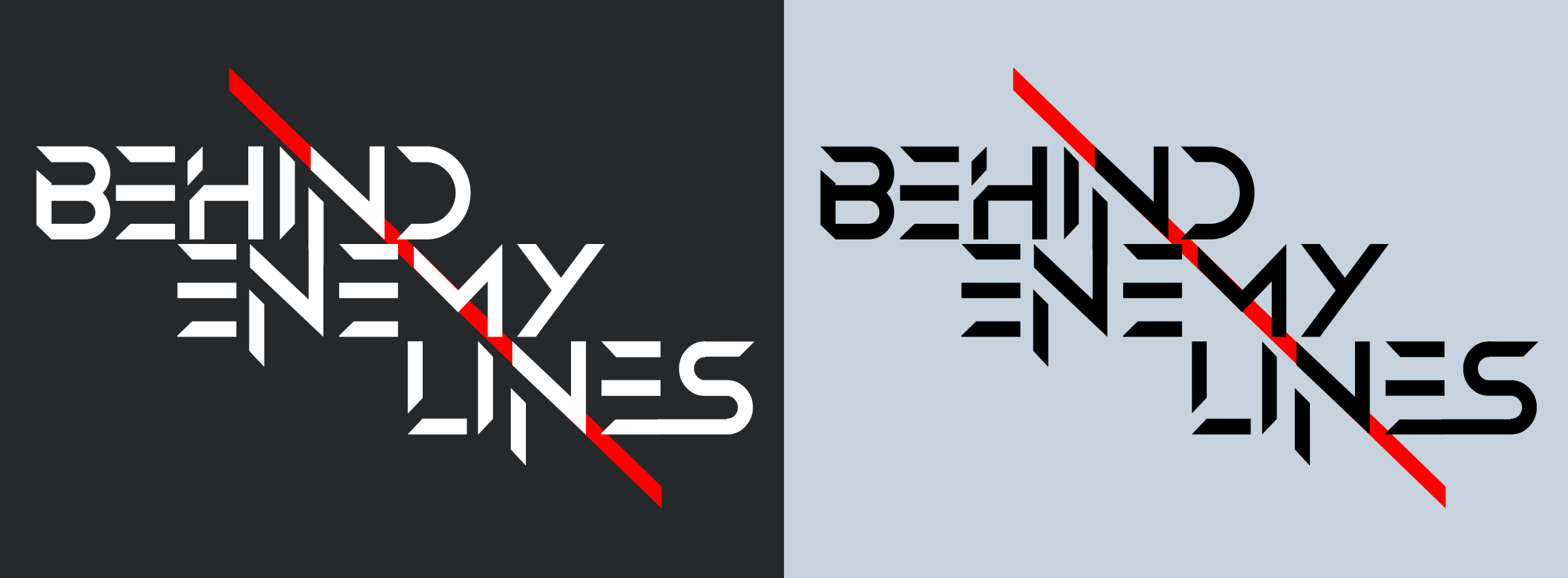
Envisioned as an XR Rollercoaster and originally branded as a Transformers experience, the Transformers IP was removed from the branding and a new logo was required.
The resulting typographic design aimed to convey a sense of aggression and danger that one would experience from being ‘behind enemy lines’, while still looking and feeling like a part of the Transformers Universe, in the event that the Transformers IP version of the project got greenlit.
Key Artwork by Rob Brunette
Divided we Fall
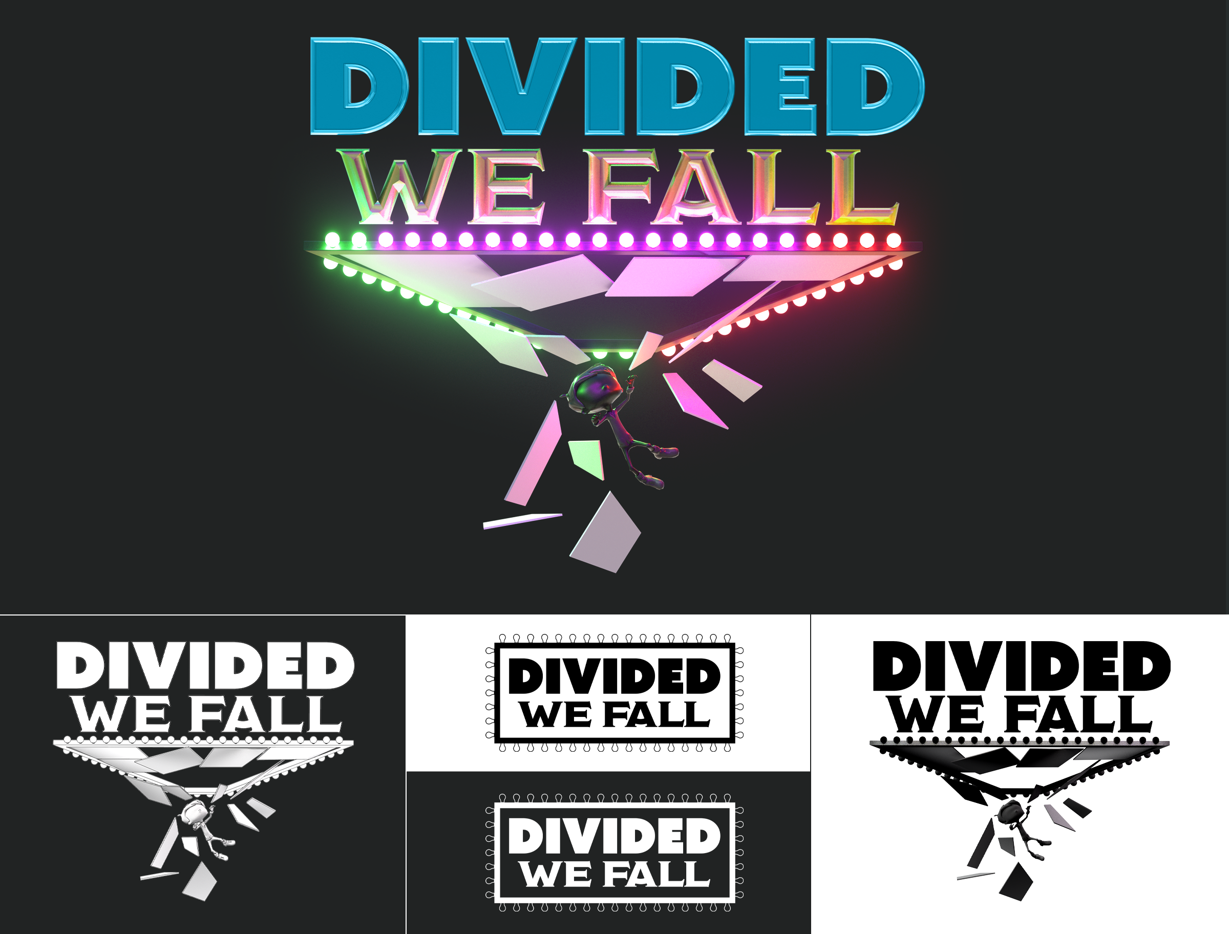
Inspired by the over-the-top game shows of old, Divided We Fall aimed to bring that sense of grandiose to the next level with an immersive VR game show experience. It would take players higher and higher above the arena the deeper they got into the game, with the floor of each loser dramatically dropping out and leaving the last person standing the victor.
In the spirit of the game itself, the logo delved into that “game show excess”, presenting a glitzy mark which both paid homage to traditional game show identities while simultaneously speaking to the most dramatic moment of the game: the fall.
Key Art by Elizer Morcillos, Slide Template Art by Me.
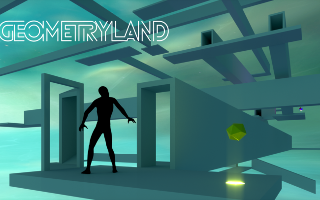
Geometryland
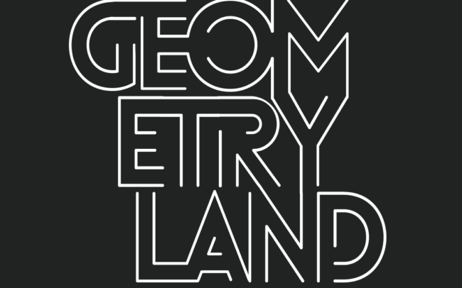
Geometryland was a pitch for a free roam VR game based off the idea of ‘Non Euclidean Space’. It used a warped juxtaposition of physical and digital space to bend a players proprioception as the core game mechanic.
My responsibilities included the branding as well as the exploration of visual representations of the idea of non-euclidean space in a way that could be easily digested. The wordmark focused on the idea of the ‘connecting tunnel’ – a core tenet of the environment design of the game.
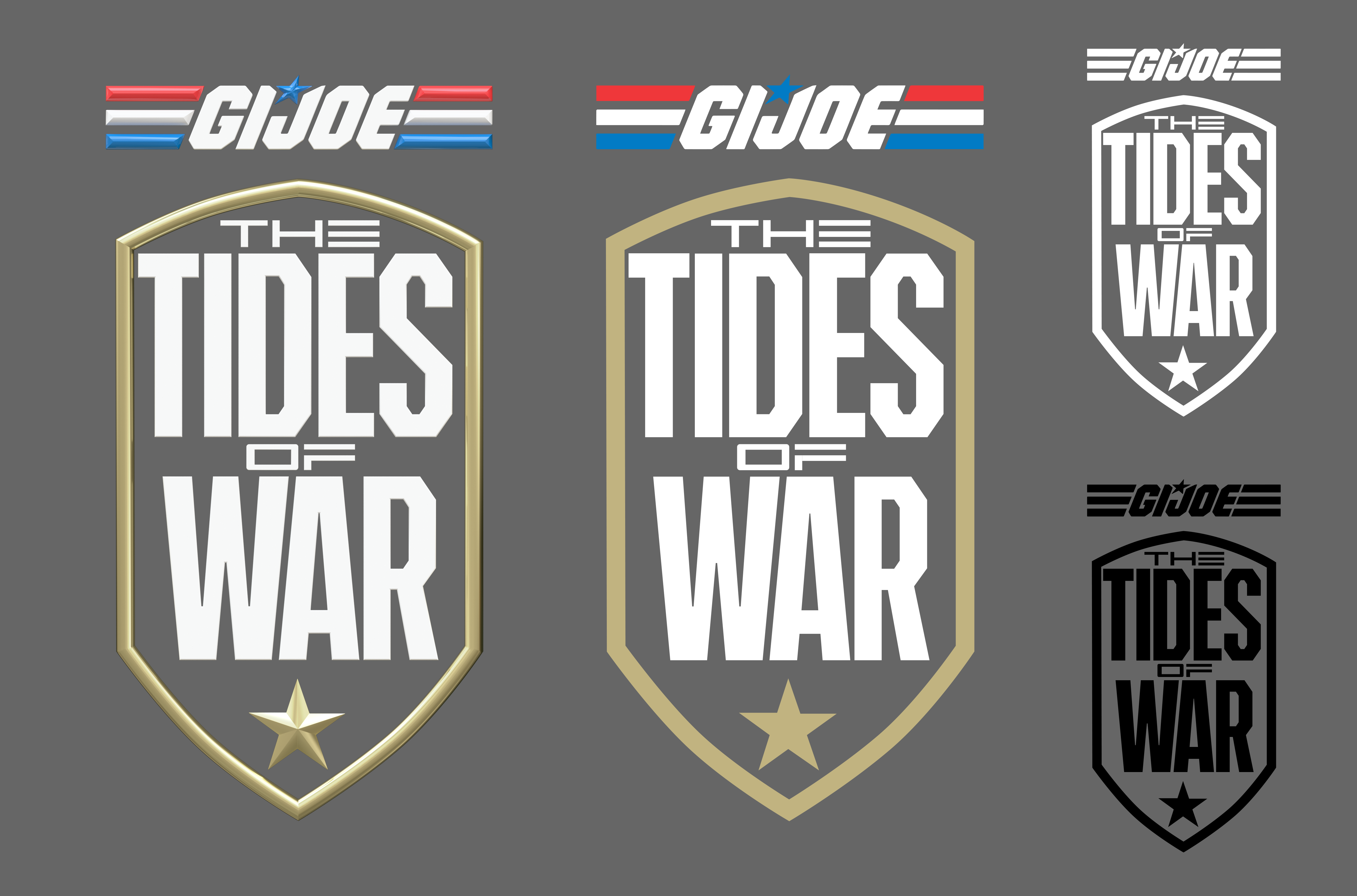
The Tides of War
The Tides of War aimed to marry the action of a wave shooter with the strategy of a tower defense by placing users in the middle of an ongoing siege.
The pitch was done using the GI:Joe IP, thus the logo had to feel like it fit within the GI:Joe universe. Much of the shape language was derived from existing GI:Joe iconography, while the letterforms were influenced by military styling.
Key artwork by Rob Brunette
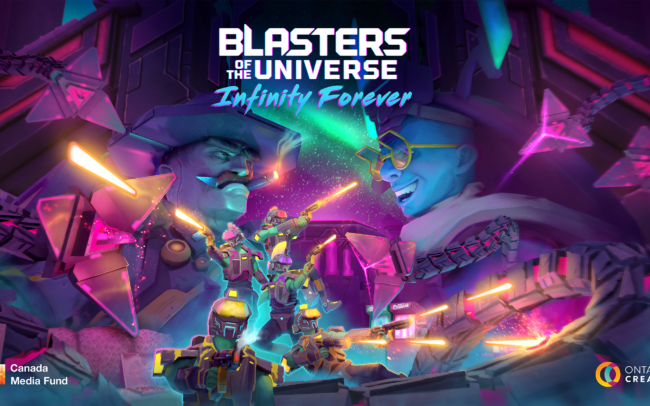
Blasters Infinity Forever
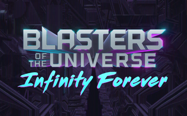
As the sequel to Secret Location’s first VR game, Blasters of the Universe, Infinity Forever already had a legacy of branding to leverage in the explorations for its imagery.
Two marks were explored – one a more traditional design closer in styling to the original, and a second alternate with a more drastic departure from the original, while still maintaining the 80’s/90s retro aesthetic.
Many of the demo videos produced at Secret Location that range from prototype gameplay to launch videos, have required a number of title animations and text card interstitials. The following videos show a selection of these types of animations.

